

Design Web Louisville transformed the client’s initial concept sketch into a professional, versatile logo for Shift Happens that maintained their creative vision while meeting all technical requirements for both digital and print applications. By carefully enlarging the design concept and refining the elements, they created a scalable vector version that preserved the character and intention of the original artwork. The transparent background ensured the logo could be placed seamlessly on any color surface or image, creating a cohesive brand presence across Shift Happens’ website, business cards, signage, and promotional materials.
portfolio

Logo Updated for Size and Transparency
Your logo is the face of your brand, and ensuring it looks professional across all applications is essential. Our logo enhancement service takes your existing logo and optimizes it for your new website, creating a version that scales beautifully while maintaining perfect clarity. By removing the background and correcting colors, we’ve created a versatile asset that can be placed on any background without visual artifacts, ensuring your brand identity remains consistent and professional across all digital platforms.
Shopify Food Sales Website Design
Sinclair Smoked Salmon needed a custom Shopify website to sell smoked salmon online. We created an modern website design using custom illustrations from local artist Matt McDole, and a platform that is easy to manage and use for the client.
Case Study: Building a Successful eCommerce Presence for a Smoked Salmon Business
Introduction
In the bustling city of Louisville, Kentucky, a home-based smoked salmon business transformed into a prominent local establishment, all thanks to a well-designed website. This case study delves into the journey of this business, highlighting the importance of a strong online presence, especially in the food industry.
The Challenge
Starting a food business from home comes with its unique set of challenges. The primary concern was how to reach a wider audience and convince them to purchase a food product without tasting it first. The client needed a platform that was user-friendly, customizable, and could handle online orders and pre-orders seamlessly.
The Solution
- Choosing the Right Platform: Shopify was selected as the platform for the website. Known for its ease of use, customization options, and a seamless checkout process, Shopify is considered ideal for restaurants and food businesses.
- Incorporating Local Art: To give the website a unique touch and resonate with the local audience, artwork by a renowned Louisville artist, was integrated into the design.
- Prioritizing Packaging and Design: Recognizing the critical role of packaging in the food industry, a professional designer was hired. This ensured that the packaging not only preserved the quality of the smoked salmon but also appealed to potential customers.
- Professional Photography: To further enhance the website’s appeal, professional food photographers were recommended. Their expertise in styling and lighting food made the smoked salmon look irresistible.
Results
The website became more than just a sales platform; it was a tool to connect with customers and share the brand’s story. Even if the majority of sales didn’t come directly from the website, it played a pivotal role in brand awareness and customer engagement.
The client’s business saw significant growth, moving from a home-based setup to a prominent location in Louisville. The website’s design, combined with the quality of the smoked salmon, convinced customers to make a purchase without tasting the product first.
Conclusion
Starting a food business online might seem daunting, especially for those whose expertise lies in cooking rather than coding. However, with platforms like Shopify, businesses can establish a strong online presence without any technical experience. This case study underscores the importance of a well-designed website in the food industry, emphasizing branding, packaging, and professional photography.
For those looking to embark on a similar journey, remember: you don’t have to do it alone. With the right tools and guidance, you can build a successful online food business that resonates with your target audience.
Window Company Logo Design
Project Overview
Design Web Louisville was tasked with creating a distinctive visual identity for Metro Window Company, a well-established window and door provider serving the greater Louisville area since 1980. The logo design needed to reflect both the company’s premium product offerings and its deep roots in the Louisville community, while appealing to both residential and commercial clients.
Design Challenge
The primary challenge was to create a visual identity that would honor Metro Window Company’s 40+ year legacy while positioning them for their next chapter under new ownership. The design needed to convey professionalism, craftsmanship, and their connection to Louisville’s architectural heritage, while remaining timeless and versatile across various applications.
Design Solution
The centerpiece of the brand identity is an elegant logo that combines architectural elements with local symbolism. The design features a fleur-de-lis, a symbol deeply connected to Louisville’s heritage, framed within a window featuring an arched top frame. This combination creates a sophisticated mark that speaks to both the company’s product focus and its Louisville roots.
Design Elements
The logo’s architecture was carefully considered to represent different aspects of the business:
The arched window frame represents the company’s expertise in premium window installations and their attention to architectural detail. The arch specifically suggests classic design and timeless quality, reflecting their high-end product offerings.
The fleur-de-lis, centered within the window frame, creates an immediate connection to Louisville’s cultural identity while also suggesting refinement and excellence. This symbol resonates strongly with local customers while adding a touch of sophistication to the overall design.
Color Palette
The color scheme was selected to convey premium quality and timeless elegance:
Gold: Represents premium quality and excellence in service Bronze: Suggests craftsmanship and durability White: Conveys clarity and professionalism Black: Adds sophistication and authority
This combination of warm metallics with classic neutrals creates a versatile palette that works effectively across all marketing materials, signage, and digital applications.
Typography
Tan Parfait was chosen as the primary font for its blend of classic elegance and modern readability. The font’s characteristics complement the architectural elements of the logo while maintaining excellent legibility across various sizes and applications. Its subtle sophistication aligns perfectly with Metro Window Company’s position as a premium service provider.
Applications
The logo was designed to maintain its impact across multiple applications:
Vehicle graphics and wraps Business stationery and cards Website and digital media Building signage Installation yard signs Product catalogs Trade show displays Employee uniforms
Implementation Strategy
The new logo was rolled out as part of the ownership transition, helping to signal the company’s evolution while maintaining its established market presence. The implementation included comprehensive brand guidelines to ensure consistent usage across all touchpoints.
Results
The new logo has successfully: Strengthened Metro Window Company’s market position as a premium provider Created a memorable visual connection to Louisville’s architectural heritage Provided a professional foundation for the company’s marketing efforts Helped smooth the transition to new ownership while honoring the company’s legacy
Client Feedback
The new ownership team, led by Russell Fallon & Family, reported that the logo effectively communicates their commitment to quality while maintaining the company’s established reputation. The design has resonated with both long-time customers and new clients, supporting their business growth objectives.
Design Impact
The logo has become a recognized symbol of quality window and door services in the Louisville area, effectively differentiating Metro Window Company in a competitive market. Its timeless design ensures longevity while its careful attention to local elements helps maintain the company’s strong community connections.
Credits
Design: Design Web Louisville Year: 2023-2024 Industry: Window and Door Sales and Installation Location: Greater Louisville Area, Kentucky
Pool Website Design
Brand Identity Development
Design Web Louisville undertook the development of a comprehensive brand identity for Polis Pools, a veteran-owned pool maintenance and service company operated by two brothers with over 20 years of industry experience. The project aimed to create a brand that would reflect their unique position as industry specialists—the experts that other pool companies turn to for complex problems.
The company’s background as a veteran-owned, family-operated business with deep technical expertise shaped our approach to the brand identity. Their service offering includes tiered maintenance plans (Gold, Silver, and Bronze), specialized equipment services, and seasonal opening and closing services, all of which needed to be represented in the brand strategy.
Our solution centered on a distinctive octopus logo mark, symbolizing the company’s multiple service capabilities and technical expertise. The color palette combines a trustworthy navy blue (#124479) with a fresh, aquatic turquoise accent (#09AEB8). Century Gothic was selected as the primary font for its clean, professional appearance and excellent legibility across all applications.
The tagline “Trusted Care, Reliable Results” reinforces their commitment to quality service and reliability. This messaging appears consistently across all brand touchpoints, from service vehicles to uniforms and customer documentation.
Website Development
Following the brand identity creation, we developed a professional WordPress website using the Astra theme, customized to showcase their services and streamline customer interactions. The website serves as both a marketing tool and a customer service platform, featuring online scheduling capabilities and a customer portal for easy account management.
The homepage immediately establishes their credibility with messaging about their veteran ownership and industry expertise. Services are presented in an intuitive layout, with detailed information about their three-tier maintenance plans, equipment services, and seasonal offerings. The site includes comprehensive descriptions of their capabilities in liner replacements, heater repair and replacement, automation installation, and pool cover services.
We integrated several customer-centric features into the website, including an online scheduling system, customer portal access, and a text notification system for service updates. The payment processing system was streamlined to provide a hassle-free experience for clients.
Current promotions, such as new customer specials offering 10% off for February 2025 sign-ups and 5% off for March 2025, are prominently featured while maintaining a professional appearance. Contact information, including their phone number (502-357-3799) and email (Service@polispools.com), is easily accessible throughout the site.
Technical Implementation
The website was built on WordPress using the Astra theme framework, with custom modifications to match their brand identity and specific business needs. We focused on mobile responsiveness and fast loading times to ensure a smooth user experience across all devices. The site includes integrated features for service history tracking, maintenance schedules, and communication logs.
Special attention was paid to search engine optimization, including local business schema markup and service area targeting to improve visibility in the Louisville market. The content strategy emphasizes their expertise and comprehensive service offerings while maintaining an approachable tone for residential customers.
Results and Impact
The brand identity and website have successfully positioned Polis Pools as a premium service provider in the Louisville market. The combination of professional design, user-friendly features, and clear communication of their expertise has supported their business launch and growth. The integrated customer portal and scheduling system have streamlined operations and improved customer satisfaction.
Looking forward, the website platform is prepared for future enhancements, including expanded customer portal features, a maintenance tracking system, and additional customer communication tools. The brand identity system provides flexibility for growth while maintaining consistency across all touchpoints.
Project Credits
The entire project was completed by Design Web Louisville in 2025, servicing the pool maintenance and services industry in Louisville, Kentucky. The client’s feedback indicates that the brand identity and website effectively capture their position as industry experts while maintaining approachability for residential customers.
Pool Service Company Logo & Brand Identity
Polis Pools Brand Identity Case Study
Project Overview
Design Web Louisville was commissioned to develop a comprehensive brand identity for Polis Pools, focusing on creating a distinctive logo and print collateral that would establish a strong market presence in the pool construction and maintenance industry.
Client Background
Polis Pools specializes in high-end pool design, construction, and maintenance services. The company needed a sophisticated brand identity that would reflect their commitment to quality and attention to detail while appealing to their upscale target market.
Design Challenge
The primary objective was to create a unique visual identity that would:
- Convey professionalism and expertise in the pool industry
- Stand out in a competitive market
- Maintain visual consistency across all brand touchpoints
- Create an immediate association with water and luxury
Design Solution
The centerpiece of the brand identity is a distinctive octopus logo mark, which serves as a sophisticated and memorable symbol for the company. The design effectively combines:
Logo Elements
- A stylized octopus illustration that suggests both aquatic expertise and the multiple services offered by the company
- Two carefully selected blues that create depth and visual interest:
- Primary Blue (#124479): A deep, authoritative navy that conveys trust and professionalism
- Accent Blue (#09AEB8): A vibrant aqua tone that adds energy and reinforces the water association
- Century Gothic font: Selected for its clean, modern lines and excellent legibility across all applications
Print Collateral
The brand identity was implemented across various print materials including:
- Business Cards
- Double-sided design
- Soft-touch lamination
- Spot UV on the logo
- Letterhead and Envelopes
- Premium white stock
- Full-color logo with contact information
- Professional layout emphasizing brand colors
- Marketing Materials
- Brochures
- Service folders
- Proposal templates
- Vehicle graphics
Implementation Strategy
The design team at Design Web Louisville ensured consistent brand application by:
- Creating comprehensive brand guidelines
- Developing templates for common business documents
- Providing both print and digital versions of all assets
- Including color specifications for various printing methods
Results
The new brand identity successfully:
- Established a strong visual presence in the local pool industry
- Created a cohesive look across all customer touchpoints
- Received positive feedback from both the client and their customers
- Provided a flexible system for future brand expansion
Lessons Learned
- The importance of selecting colors that work well in both print and digital applications
- The value of a symbol (octopus) that can be used independently of the full logo
- The benefit of creating a comprehensive brand system rather than just a logo
Future Applications
The brand identity system was designed to accommodate future growth, including:
- Digital marketing materials
- Social media templates
- Signage systems
- Branded uniforms and equipment
Client Testimonial
“The new brand identity perfectly captures our commitment to quality and attention to detail. The octopus logo has become instantly recognizable in our market, and the comprehensive print materials have elevated our professional image significantly.”
Credits
Design: Design Web Louisville Year: 2025 Industry: Pool Construction and Maintenance Location: Louisville, Kentucky
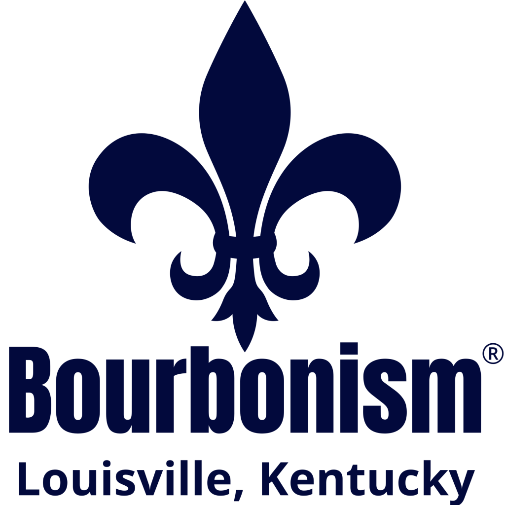
Cultural District Branding, Marketing, and Merchandise
The Bourbon District in Louisville, Kentucky, is a prime example of how integrated marketing and branding strategies can revitalize a walkable district, enhancing its appeal to both locals and tourists. With a rich history intertwined with the bourbon industry, the district offers an array of distilleries, bourbon-themed shopping, tours, and historical sites, making it a unique destination for bourbon enthusiasts worldwide. This case study highlights the comprehensive approach taken by our team to brand, market, and promote the Bourbon District, focusing on place-making initiatives, merchandise development, and digital marketing strategies to fuel economic development in the region.
Place-making for the Chamber of Commerce and Economic Development Corporation of a Walkable Business District
Background
The Bourbon District is home to historic businesses like Vendome, a renowned maker of copper stills, and is a major tourism attraction in Louisville. Recognizing the potential for economic advancement through tourism, the local Chamber of Commerce and Economic Development Corporation sought to enhance the district’s branding and marketing efforts to attract more visitors and encourage longer stays.
Project Overview
Our team was tasked with creating a cohesive branding and marketing strategy for the Bourbon District. The project aimed to increase visibility, improve wayfinding, and create memorable experiences for visitors, thereby supporting local businesses and promoting economic development.
Strategies and Implementations
1. Branding and Identity Development
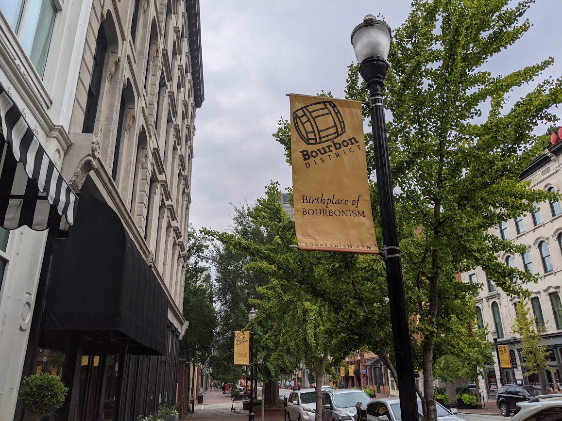
- Trademarked Domain and Recognizable Mark: We assisted in purchasing a trademarked domain name for the district and created a recognizable mark that symbolizes the Bourbon District’s unique identity. This mark was prominently displayed on banners throughout downtown Louisville, establishing a strong visual presence.


2. Digital Marketing
- Dedicated Website: A dedicated website was developed to serve as a central marketing hub for all participating bourbon locations within the district. The website features comprehensive information about tours, shopping, dining, and historical attractions, making it easy for visitors to plan their visit.
3. Place-making and Wayfinding
- Maps and Brochures: Custom maps of the district were designed for brochures, enhancing the visitor experience by providing a tangible guide to explore the area.

- Wall Murals and Building Wrap: A full building wrap mural was created to encourage visitors to take selfies and share their experiences on social media, thereby organically promoting the district.

- Historic Map Markers and Wayfinding Maps: Updated historic map markers and wayfinding maps were installed at every corner, improving navigation throughout the district. Ground stickers were also employed to guide visitors to key attractions.


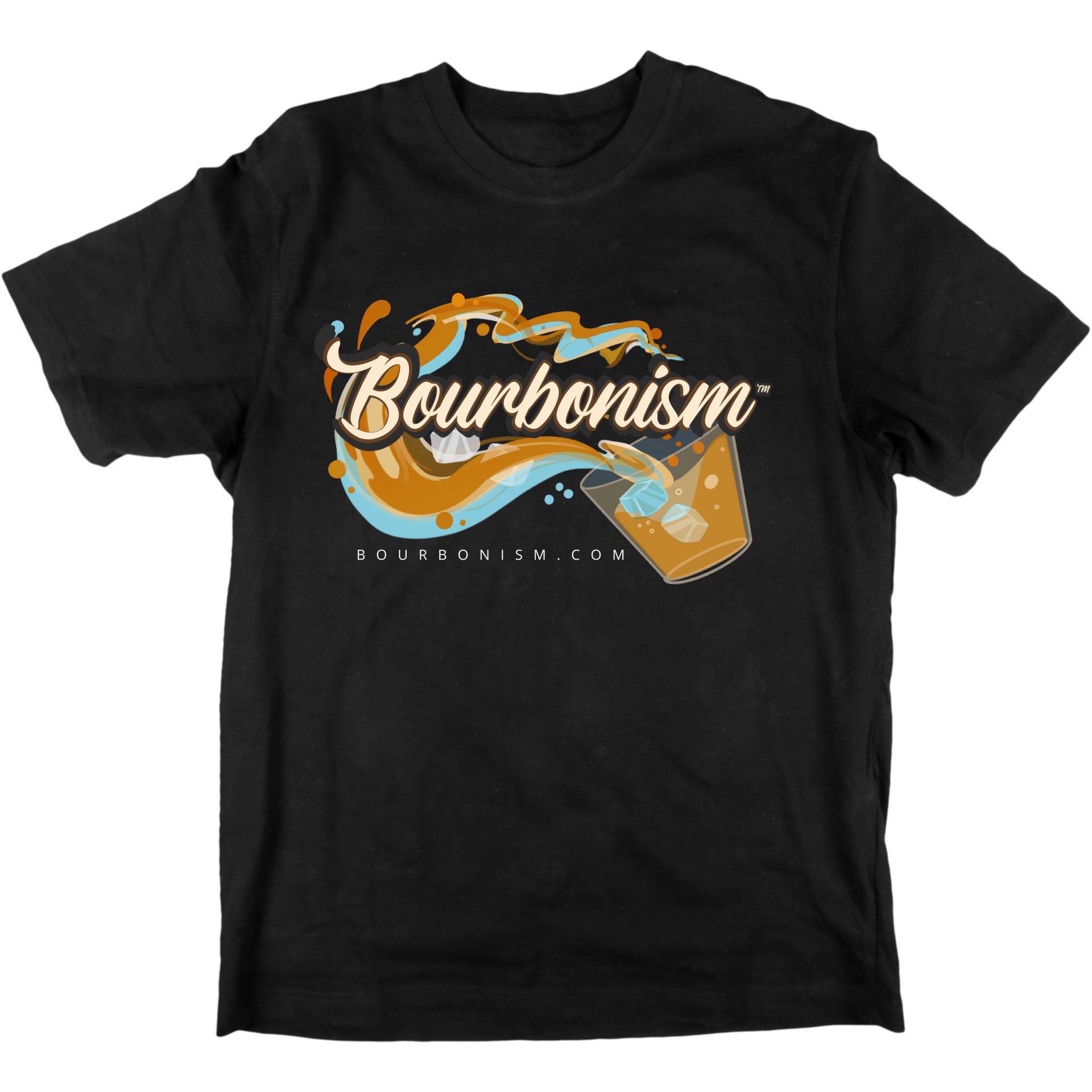
4. Merchandise Development
- A complete set of merchandise was developed to enhance the tourism experience, allowing visitors to take a piece of the Bourbon District home with them. This range included items that captured the essence of the district, further promoting the brand beyond its geographical boundaries.


Outcomes
The comprehensive branding, marketing, and merchandise strategy implemented for the Bourbon District has had a significant impact on its economic development. Key outcomes include:
- Increased Visitor Engagement: The interactive and visually appealing marketing materials, such as the mural and wayfinding signs, have significantly increased visitor engagement and social media presence.
- Enhanced Visitor Experience: The provision of detailed maps and a dedicated website has made it easier for tourists to navigate the district, resulting in longer stays and increased spending in local businesses.
- Strengthened Brand Identity: The creation of a unique mark and the widespread use of branded merchandise have strengthened the Bourbon District’s identity, making it a recognizable destination for bourbon enthusiasts globally.


Conclusion
The Bourbon District’s branding, marketing, and merchandise project demonstrates the power of integrated place-making strategies in promoting economic development. By creating a cohesive brand identity, enhancing digital and physical wayfinding, and developing a range of merchandise, our team was able to significantly improve the visitor experience, thereby contributing to the district’s economic success. This case study serves as a model for other economic development corporations and chambers of commerce looking to revitalize and promote their districts.
Electronics and Computer Parts eCommerce Logo Design
“As the designer tasked with creating a logo for an Electronics and Computer Parts eCommerce Website, I began by brainstorming a variety of different concepts. After much deliberation and sketching, a unique idea emerged: incorporating a unicorn into the design. The unicorn symbolizes integrity and the sense of wonder that surrounds tech gear and networking technology. We felt that this imagery perfectly captures the essence of the Bitsquad brand and sets them apart from its competitors. We are excited to see how this logo will be received and to continue creating visually striking designs for the website that bring visual value and cohesive brand recognition to the project as a whole.”
Cleaning and Restoration Company Website Design
As a website designer for a cleaning and restoration company, it is important to create a website that effectively markets the company’s services, experience, and expertise. This includes incorporating professional and polished design elements, showcasing customer testimonials, before and after photos, and providing detailed information about the services offered including emergency services as well as the unique and high-quality tools they offer clients.
Search engine optimization took a key focus in the website design to ensure that the company’s website appeared high in search engine results for relevant keywords. The website is also mobile-friendly and easy to navigate, making it easy for potential customers to find the information they need.
We were sure to incorporate an easy-to-use contact form, a phone number, and email address prominently displayed on the website, and additional integrated tools to make it easy for potential customers to reach the company to schedule an appointment or request a quote. Social media was also integrated into the design as it is also crucial for the company’s marketing efforts, providing a platform for the company to connect with potential customers and share its latest projects, services, and offers.
Email marketing campaigns were integrated into the website design, allowing the company to keep its customers informed about its latest services, promotions, and offers and to maintain a strong relationship with existing customers while attracting new ones.
Sports Center Website Design
We, at Design Web Louisville, created a custom website for Smash Zone Baseball that features their trainers and events at their location. We included a custom editable birthday invitation template for their birthday events rental pages and an easy-to-edit back end. The website allows them to sell sign-ups and connect with parents and students. The website redesign was successful and exceeded their expectations. This baseball training center website design showcases state-of-the-art facilities, experienced trainers and, personalized training programs, testimonials, a schedule of classes and camps, making it easy for players and parents to find the right option they need to get in the batting cages and start swinging.


© 2026 design web louisville | Sitemap